Tuesday, June 26, 2007
Backyard After!


My Backyard Renovation


Thursday, April 13, 2006
Modern Rustic
So over at Apartment Therapy there has been a spirited discussion about the "Modern Rustic" "Urban Country" "Soho Shaker" (not my invention...i think Melinda is the authoress) aesthetic...one to which i ascribe.
It's bascially Country without the K. Rustic bones, natural finishes and materials, and clean, simple furniture. No clutter, everything purposeful.
There is actually not too much difference between actual Shaker and Soho Shaker, except for the stray chrome table or lucite chair.
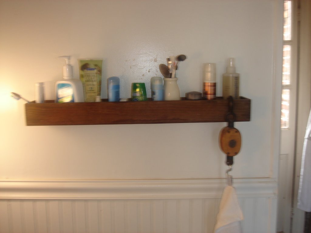
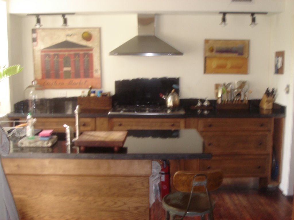
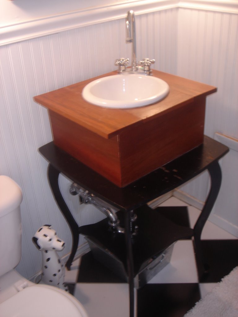
The best example of the style is at Christian Liagre's island house near La Rochelle Il St. something that I still can't remember. Don't think Il St. Lo, but could be. I can't find any electronic pictures to link to, so I'll include some from my own house, which is heavily influenced by his place. His palette is white, black, brown and charcoal, with straw baskets and the like -- but not too many. Everything is quite geometric. My palette is slightly less restrained but also hinges on black, brown and white -- with a hit of red and avocado on the ground floor, and Tiffany blue upstairs in the bath. I love the bath; I built the Brazilian cherry box in which the sink sits, and the table is an antique oak table that was repurposed to hold plumbing. I also like pullies (you'll see). And in my kitchen, I cut my own granite counters (my dad's in the biz. great big saw). He made the granite sink for me based on my drawings and measurements. The backsplash is the natural edge of the granite -- normally tossed out at the fabricator -- and the kickplates are mirror. They totally freak my cats out, but they bounce a lot of light in the room.
Wednesday, January 25, 2006
Before and Post-Baby After
The remainder of the first floor was (and remains) devoid of natural light, but with some cool changes, it now feels warm and airy. It ain't a sunfilled manse by any notion -- no windows were added -- but it shows what can be done with a few key changes.
The townhouse is home to Jeannie and Mark and now the insanely adorable, round, red cheeked, big-headed Oliver.
The house is a long narrow rectangle, with the kitchen at the back. The kitchen backed up to a storage room with a door (a room about 8 feet deep and 12 feet wide). Jeannie and Mark knew from next-door neighbors that above the storage room there was about 8 more feet of unused airspace above their heads. They initially wanted to bust out the ceiling and make the room a bedroom with en suite bathroom. (this is what it looked like from the kitchen)
I worked very hard to disabuse them of this plan. No one wants to sleep in a bedroom without a window...it would be like a cell or an insane asylum. Instead, what they needed (I thought and they eventaully agreed, god bless them) was to open up and expand the kitchen. My original plan -- in deference to their desire for lots more storage -- was to have shelves going all the way up the back walls clear up to 12 feet...but they nixed thast, and its a good thing. I was a little worried about it feeling top heavy and crowded and robbing the room of its height and feeling of light.
They also wanted a bathroom and a place to do laundry, and this was provided by tapping into the existing kitchen plumbing.
The kitchen lay out was awful -- the fridge in a dead corner that made it hard to access when you were cooking, and if the butcher block was in the room...a pain to get to all together. 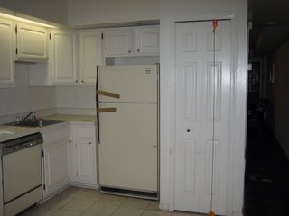 I recommended (and they agreed) they move the fridge down to the end of the kitchen where the new room would be opened up to (lined up with bathroom and laundry closet...a utility wall. good to do. Fridges take a lot of visible space, so its nice to nestle them up against larger structures so they dont seem like hulking freon islands.)
The range then went into the fridge corner -- the right place for it -- because only one person would ever need to access that.
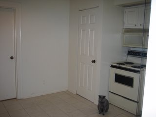
here is a before, picturing the old laundry closet, and the after, with the fridge where the range was and the back wall open.
Above the cabinets was a pointless bulkhead/soffit. My amitious first plan (that I am still bitter did not come to fruitin) was for a matching offit to be built across the room and then a wooden barrel ceilingg to be installed...making the soffits make sense and driving the attention to the center of the room rather than along the low hulking edges.
They opted for a more practical andn easier flat ceiling, but did away with the soffits and replaced with cabinets that go all the way to the ceiling.
Cabinet choice was critical. They toyed with traditional cabinets with molding etc. but (again, less them) agreed with my view that the molding just makes your eyes feel crowded. This is a small, dark narrow ktichen - the eye doesnt need any more detail to deal with. Flat front cabinets it was.
They got a green granite countertop and honed the surface, making it matte rather than the standard shiny...which is very common and kind of flashy. The matte surface is beautiful, powedery looking, gives a real sense of the stone that says, "look at me the stone" rather than "look at your reflection!"
After much work, they opened up the back room (removing lots of cinder block), blew out the ceiling, installed the bath and laundry closet, and painted it all a warm but sunny yellow. Here's a view from the kitchen into the new back room, all one space now. notice that the hanging cabinet in the foreground in a nearlier pcutre is gone. Thank heaven. It looked like buckteeth and made me want to tear my eyes out. Anyway, the new toilet is in the door near the back wall, the laundry is in the door closer, and there is a deep storage ledge above them. The rest of the ceiling goes strsight up to 12 feet. It's an amazing and unexpected space in such a small, relatively dark and predictable townhouse. It reallt makes you hang out in the kitchen. I wanted them to build banquette seating back there and have a dining table in the corner where Mark has his desk, but this seems to be working for them.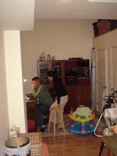
The biggest change, however, was the floor. The original 70s era dark wood parquet was itted and awful and dark. They put it light wood (bamboo? I can't remember) all over the first floor and the whole place seems worlds brighter. A good rule of thumb in small places -- unify materials and paint throughout as the eye will read the space as one large area rather than a bunch of small blocks.
Another benefit of the wood floors -- it coomepletely lightened up the living room which is dominated by a dark brick wall. With the old floor, it seemed as though the only answer was painting the brick. Now it's a great addition to the room as is. this is after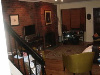 this is before...yipes.
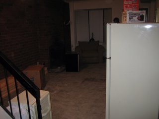
Keep in mind that the eye goes to contrast -- so if you have something you want to hide (a crappy ceiling? an ugly door) paint it the same color as what's around it. Dont feel constrained to follow "rules" like wood trim should be painted in glossy white, or ceilings in flat white. IN the kitchen an unattracctive utility room dooor was painted the same yellow as the walls (next to the range in an earlier picture, and originally next to the fridge), and it disappears into the totality on the kitchen, lending strength and reinforcement to the sunny yellow rather than drawing the eye to its old skank self.....which is another interesting point. In the kitchen and new room, Mark accidentally painted the ceiling the same yellow as the walls...and it looks brilliant. You're eye just goes up and up and over. No contrast, no breaks. Wonderful.
The net result, while a little disheveled in the photos (combine 6 month old baby, a weekend at home, and ordered in pizza for me) is marvelous, a total change. They love it, I love it...all very satisfying. Here is a lovely bit of serendipity -- it's the ceiling in the corner of the new room (but it's on its side, so tilt your head to the right. the right side is the ceiling) -- it looks like an Escher drawing, and would cost a billion dollars if you designed it and told the contractor to build it. Instead, its all the boxing in of various pipes and vents. Lovely.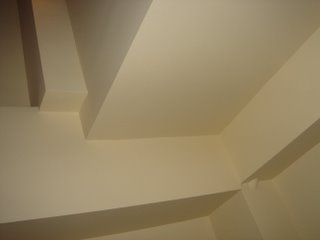
And they got it done just in time for Oliver to come along, and for them to be thinking they now need a bigger house so Jeannie's parents can come visit.
Monday, January 09, 2006
Backsplash!
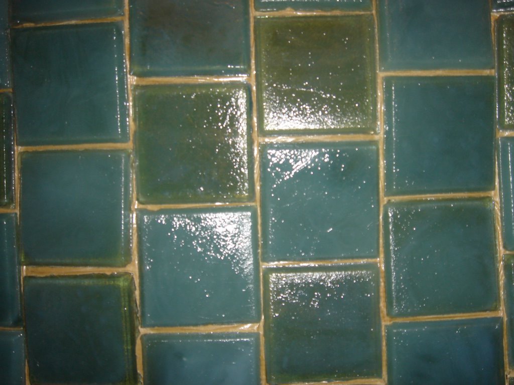
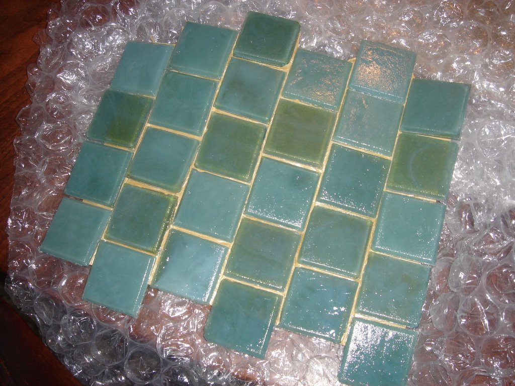
Adding to the exquisite torture of not knowing if Liam is going to go ahead with his renovation, I've just received a sample of backsplash tiles from my dad, who is a contractor in florida. They are leftover from a massive job and we can have them for a song... if Liam goes ahead.
They are just what he wants and the price is right. As you can see, gorgeous. 2" squares, from Oceanside glass, usually sell for $26 a square foot or something ridiculous like that. No idea why the pictures appeared so many times, but there they are...worth 4,000 words.
Friday, January 06, 2006
A boring meeting...
that brown semi-circular mass at the top is my coffee mug, necessary to hold open the bound notebook in which I drew. I swear I have post-it notes with whole room renderings. it's a sickness.
Thursday, January 05, 2006
This is Spinal Tap
Sheltering Roof threatens to engulf entirety of Friendship Heights
see the sheiks? ---->

Now, you can argue that it's so lovely to eat out under the stars with no restrictions whatsoever...and indeed it is. But put that same picnic table under the boughs of a tree, or pop open an umbrella (even at night, hang some candle lanterns off it) and you'll see what I mean. All of the sudden you are in an intimate place, you're protected, and your food just tastes better. You hang out a little longer, remember it as a magic albeit temporary space.
So I'm sitting around thinking about Liam's kitchen sheltering roof (see OCD-reference and drawings in last two posts) and wondering why on Earth I would not extend the roof all the way to the north wall of the apartment to cover the entire dining area? What was I thinking?
I visualized sitting in the dining area with the roof stopping about three or four feet from the kitchen, and I thought, if I am sitting under that and the person next to me is not covered by the same pavillion, I won't feel like we are in the same room. They'll feel exposed, like they could be rained on, and I'll feel like I've got a weight over my head...I imagined myself trying to swat away the roof like a buzzing mosquito. Not good.
But pull it all the way across and everyone is in its embrace. It is not a hindrance anymore, it's a unifying, architectural hug.
This plan is doubly brilliant because his place is currently entirely open -- there is no definition to where the dining room is and where the living room is. I don't want to change that -- it's a swinging 60s building, after all, when open plan was positively Revolutionary ("throw off the spatial shackles of those prudish, repressed Victorians!") -- but the roof will give the dining area a sense of place, of intimacy, and it will make it a retreat or a refuge off the wide open living room (like the alcove bed).
You can sit at the dining table and read the paper and still be within eyeshot of your honey in the living room (now conceptually 18 X 21 feet...still quite large),but not feel like you are all up in each other's grill. As I said, brilliant. Ditto for the alcove bed. Now you can have three people in that one room, each with their own space. Just don't turn the TV on too loud.
Sadly, received disturbing news today that the renovation may be scaled way back as Liam might be taking a job overseas. While losing Liam...and the summer rooftop swimming destination... would be tragic...MY SHELTERING ROOF may not live to see the light of day. APPALLING. We may still do the kitchen. I'll see if I can't talk him into shelling out for the carpentry for the roof, which will truly be magnificent and not too expensive and can stand alone without the other alcove. If he comes back, we can add the alcove bed and entry then. And do the master bath...sigh. A redwood-lined shower room..
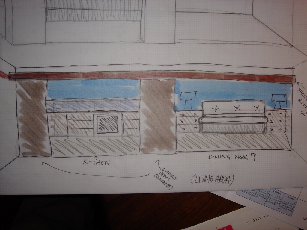
I've done an elevation sketch of the new dining refuge...although ti tried to morph into a perspective drawing. You may post your pleas to Liam that he carries out this renovation fully if only so my genius can be recognized while I still draw breath. Famous after death holds no water for me.
Tuesday, January 03, 2006
The Sheltering Roof
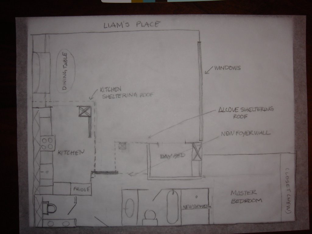
These hastily drawn pictures should help explain this whole sheltering-roof concept I'm pitching to Liam, which I am overly enthusiastic-bordering-on-OCD about.
On the top, a floor plan. The hash-marked lines indicate the roof over the alcove and the kitchen. These roofs will be held aloft by polished cement columns and will hover over polished cement floors, unifying the two spaces.
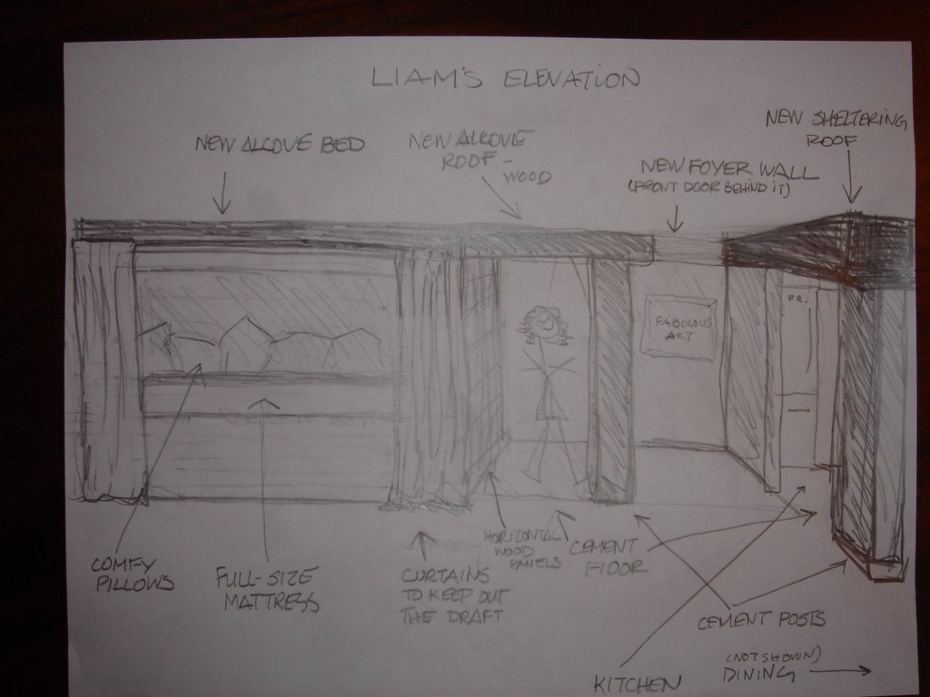
Below it, a quasi-perspective drawing of what a stick-figure girl with curly hair would look like walking into Liam's place from the front door. She has darted around the new foyer wall and is extremely impressed with my design.
The roof structure and entry alcove will be a transition space from the outside in, and will separate the private sleeping and bathing areas from the public living room.
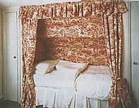
The alcove day bed is inspired by Thomas Jefferson's bed at Monticello as well as old train berths. It will provide a retreat for reading or napping as well as a guest bed and additional cozy seating during a party. The drapes can be drawn for privacy or against a draft in the winter, and can be removed in the summer.

See?
Liam's Renovation

This is a new project with Liam, a friend of two other clients (who are now also friends, because that's how we roll at Red Notebook Studio. Pictures of those projects to come. It involves going to their houses, making sure everything is cleaned up, downloading, it's a whole big thing.).
Liam lives in an 1,100 sq foot condo in Friendship Heights (olympic size outdoor pool on the roof, which is where you will find me this summer after I cement friendship with Liam. See above). Liam is caught between wanting to live in a grand English Manor, a French farmhouse, and a South Beach apartment.
I stand foursquare against home as Epcot Center (if you've been there you know of what I speak) but I've found ways to bring in what he wants: solidity, warmth from wood, and a fresh, hip color palette with clean lines. I think I have, anyway. Did I spell palette correctly? I'm having trouble with homophones lately.
The building is circa 1960, and his apartment is huge with a northwest exposure on one wall. The place has what I think are going to be gorgeous walnut-stained oak parquet floors under a horrific teal wall-to-wall carpet. The kitchen is a closed galley and poorly laid out. We're gonna open that up, continue the cabinetry into the dining area and install a banquette and table for eating, facing the expanse of windows.
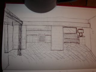
We're also gonna do a tricky thing with a set of closets that is going to be very difficult to explain until I get some before pictures. I've tried unsuccessfully to load a computer-drawn bmp image of the floor plan that would make all of this very clear. Bear with me.
Liam came over Sunday night (Jan. 1, both of us a little hungover) to look at a new floor plan. Just before he came over, though, I was staring at my sketches and realized I could give him the foyer he wants with a few tweaks to the design. When he arrived (to a snack of hot tea -- because livers were rebelling -- duck liver pate and Stilton cheese with those mini toasts which always remind me of a very drunken and ill-advised night in southern France with two lecherous Dutchmen) I pitched the new idea and he liked it, and after he left I was hit by sheer genius and quickly sketched out the above drawing, which you are seeing before he is. I should email it to him. In fact, I will.
Anyway, the drawing is by no means great art, but is shows how we will address one of the problems we have if we tear down a closet to open up a new entry to the living room: the yucky ceiling. It's covered in that popcorny anti-fire coating. If we do demolition, we are likely to leave an area bare of that coating, creating an even worse eyesore. SO: I designed a dropped ceiling to be made of wood (walnut? brazilian cherry?) over the new opening, rested it on the new foyer wall like a house of cards, and repeated the dropped ceiling and overhang over the kitchen to make it all make sense. It's a little bit Frank Lloyd Wright, who liked to design entry ways a little lower and darker so when you emerge into the living space it's expansive and bright in comparison. It's also a little bit "Pattern Language" --see the "Sheltering Roof."
It gives you a sense of having arrived somewhere on purpose, an intentional place. It also gives us an oportunity to do low-fuss recessed lighting. The challenge is going to be the wood tone. The floor is the color of bitter chocolate, and the cabinetry is going to be a medium-wood tone. Neither of us want blonde wood as it looks too 70s Fern Bar, but trying to match either color stain is going to be a challenge, and we don't like matchy-matchy anyway.
In any case, that's the current plan (my current plan. Liam has yet to see it, as I said). The drawing is looking at the entry alcove and kitchen from the windows. It's freehand -- no perspective grids were harmed in the creation of it -- so some of the proportions are slightly off. But if you squint it looks great. Frank would either be proud or disgusted at the blatant rip off, I can't tell.
![]()